
Transylvania Brewing Co.
/
Proposal design for Transylvania Brewing Company. Although it's not the winner design and meantime the name has changed to Transylvania Ale, I preferred to publish this project in its original form to keep the actual idea.
/
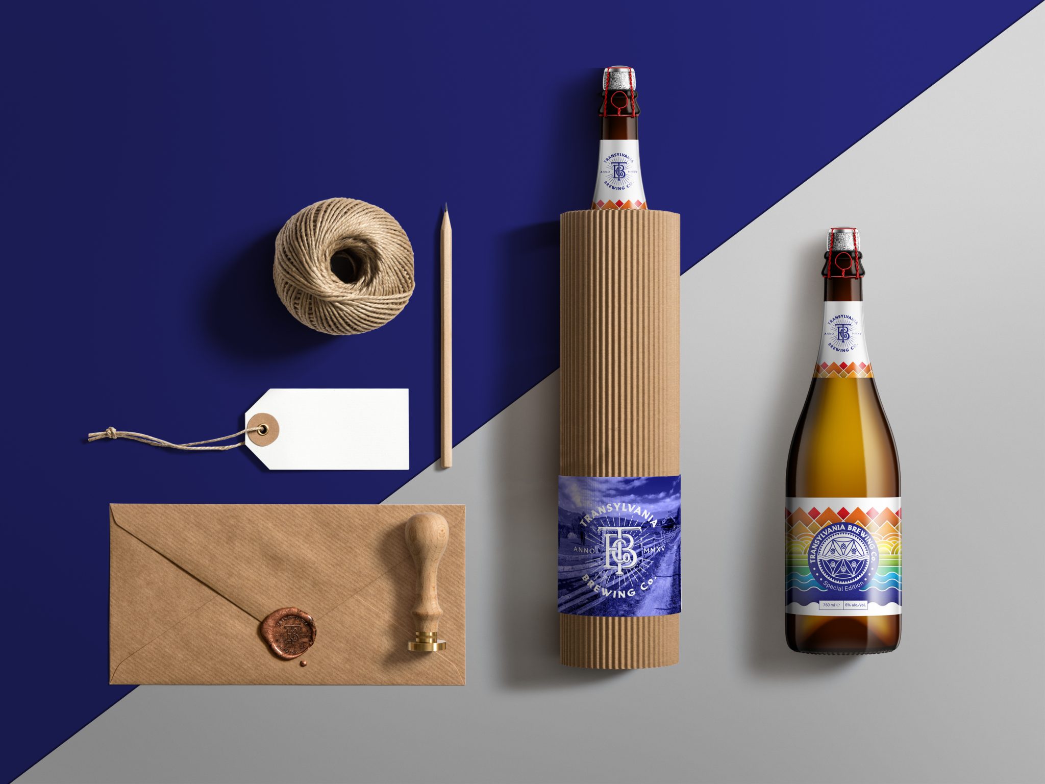
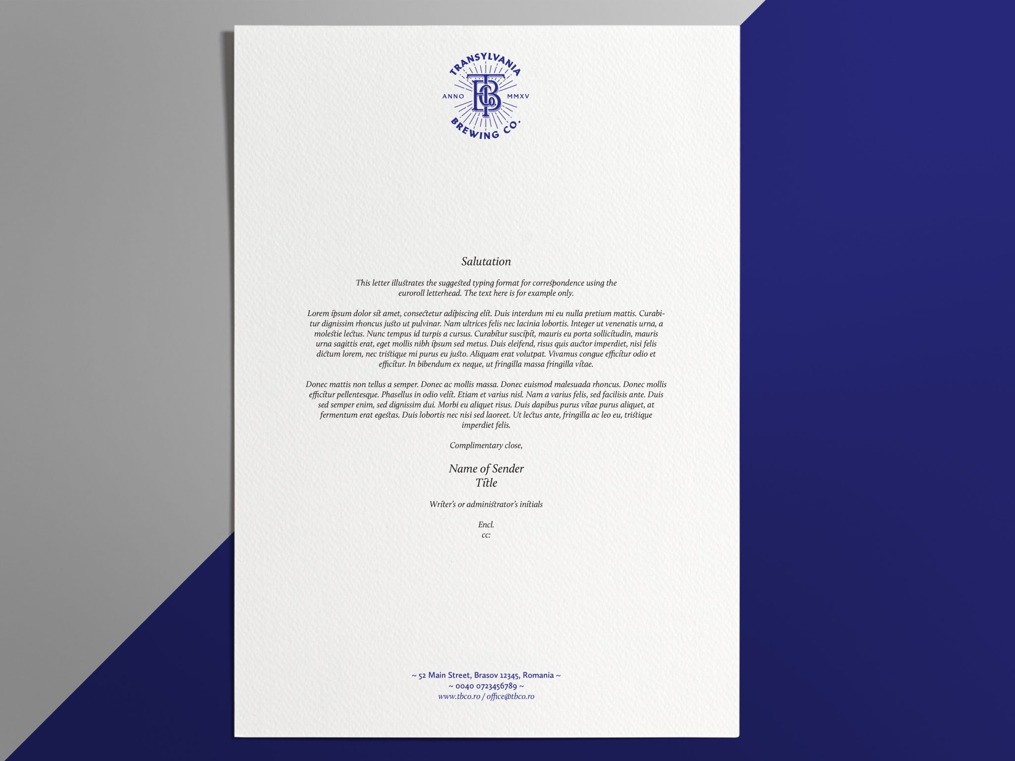
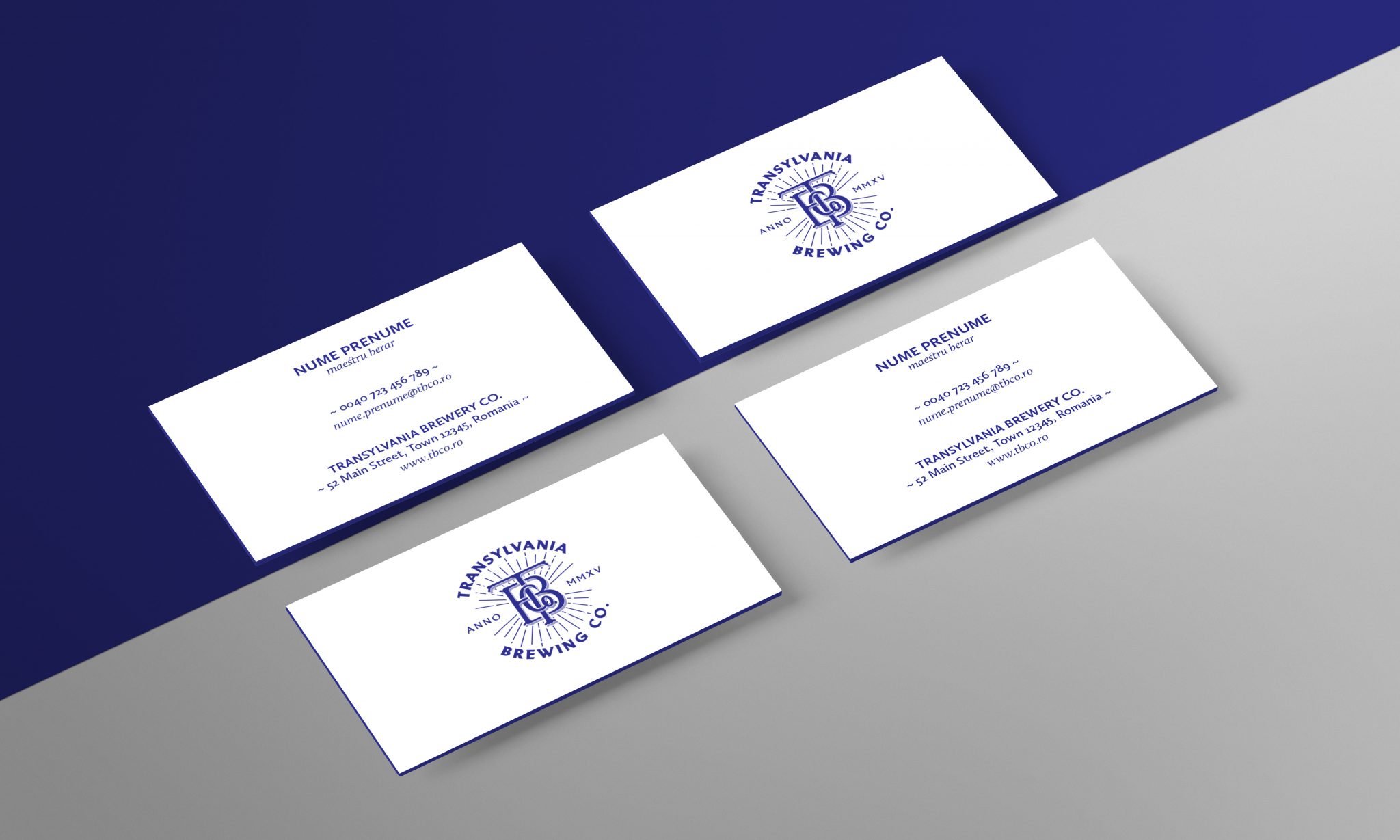
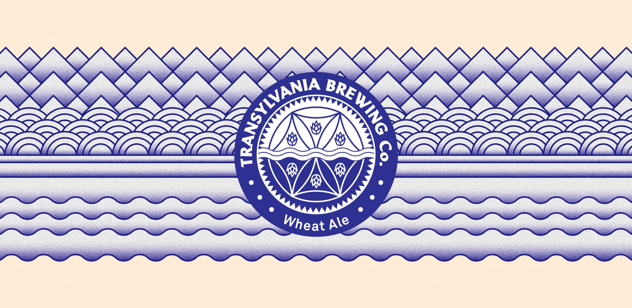
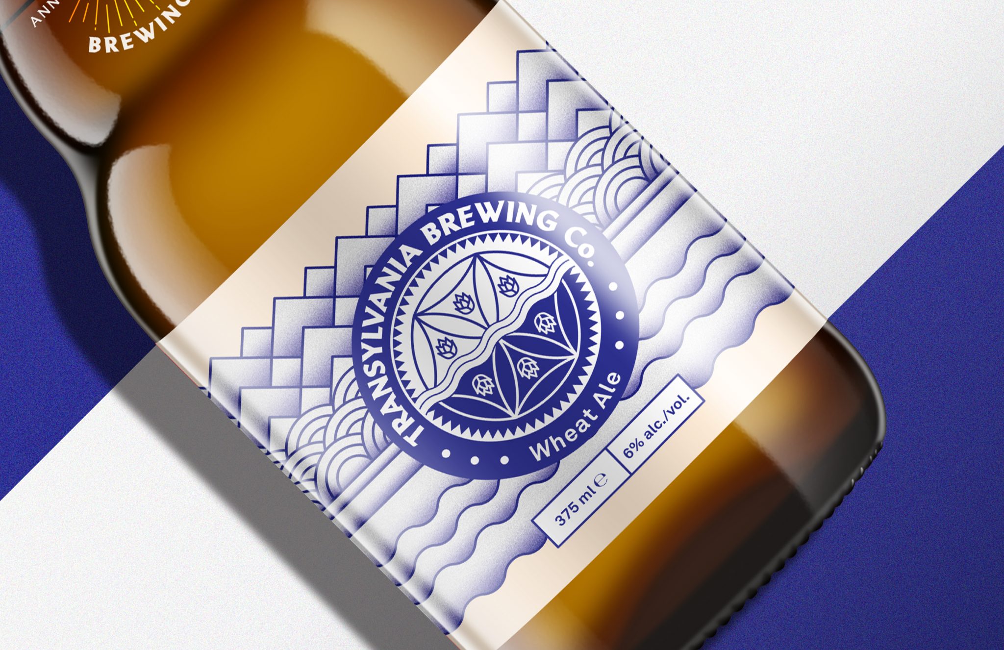
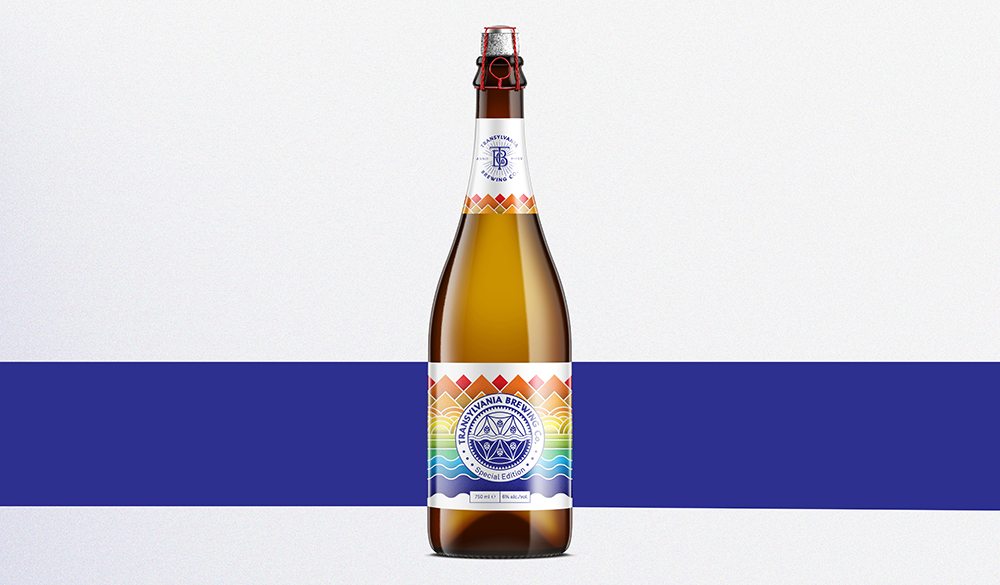
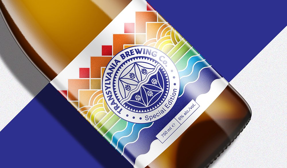
The packaging design of TBCo. beer stands out through simplicity, but not at all in a sense of dullness. Certainly, it is very playful, but at the same time, has a strong, serious symbolism behind it because heritage is one sturdy element on which the whole design is built.
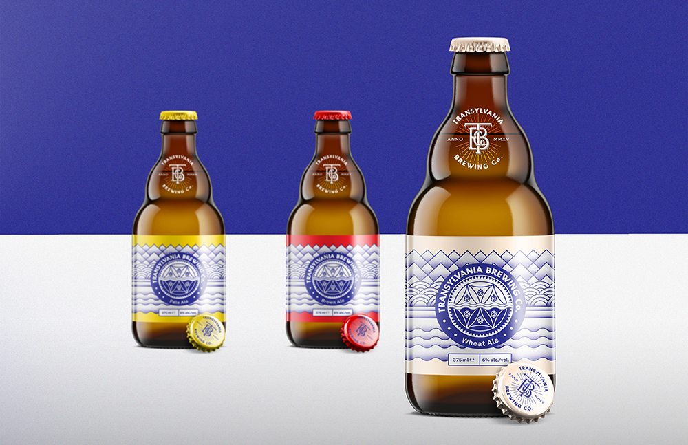
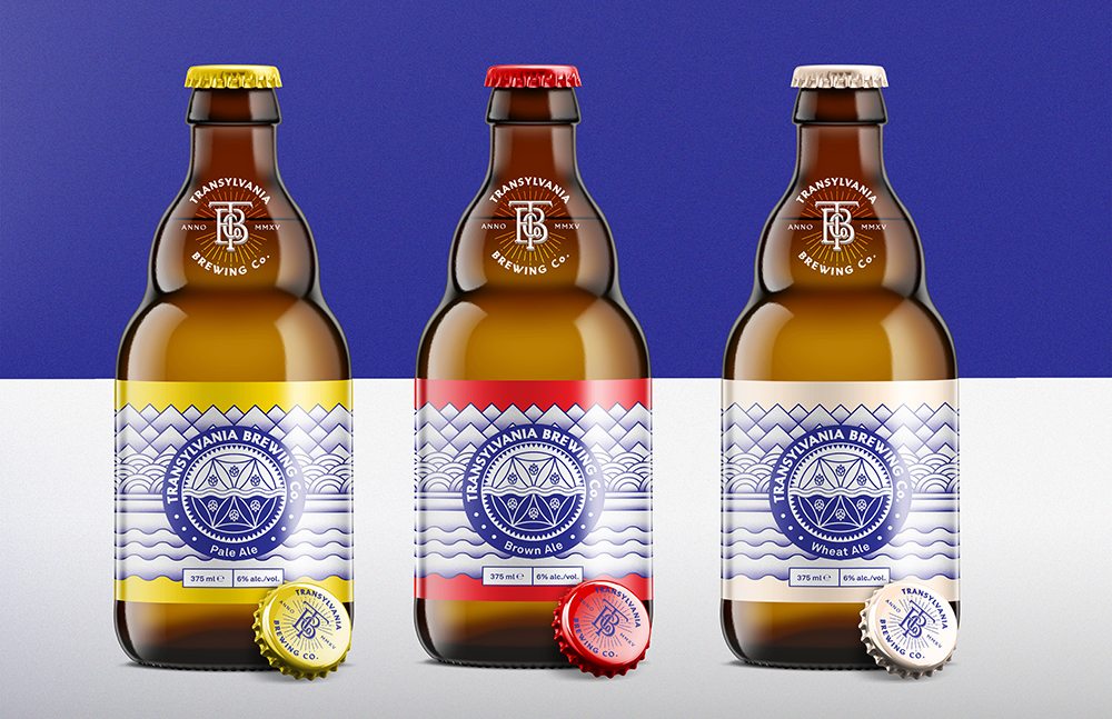
The playfulness of the labels is marked out by mixed shapes and bright colors; we have curved lines, straight lines, circles, and triangles. Each of these elements has a correspondent in nature: curved lines are for water, straight lines are for lowlands, circles are for hills, and triangles are for mountains. In one word, we have diversity and completeness and these are the words that best describe the artisanal beer contained by the designed bottles.
This product was made with attention to nature, to folklore, it was made with the best ingredients and brewed with passion and patience and this is what my design intends to reflect.
/
Showcased on: Packagingoftheworld.com
/

Design inspiration
/
For the label design and logo, the inspiration came from the Transylvanian nature (mountains, hills, lowlands & rivers) and folklore, traditional motifs.
/

Pale Ale

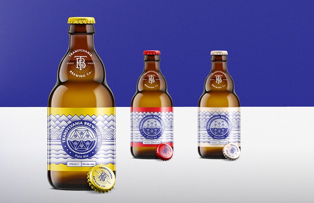

Brown Ale


Wheat Ale
Special Edition

Gift pack & Launching invitation